Comfy Org (ComfyUI) · 2025.08 – 2026.03
ComfyUI Design System: Storybook & Shared Modal Migration
Introduced Storybook and shared modal primitives, then migrated every product modal. Template clicks tripled.
Overview
As Code Owner for the design system on ComfyUI's frontend core team, I led it end to end: raising the problem, getting the team to agree, building it and rolling it out across the product. It all happened in English code review, and the full history is public on GitHub.
Background
Problem
- PrimeVue defaults and custom CSS were mixed, so the UI looked different from screen to screen.
- Similar components had split into several versions, and each contributor built things their own way.
Goal
- A design system any open-source contributor can understand and reuse.
- Move every product modal and shared component onto the new system.
What I did
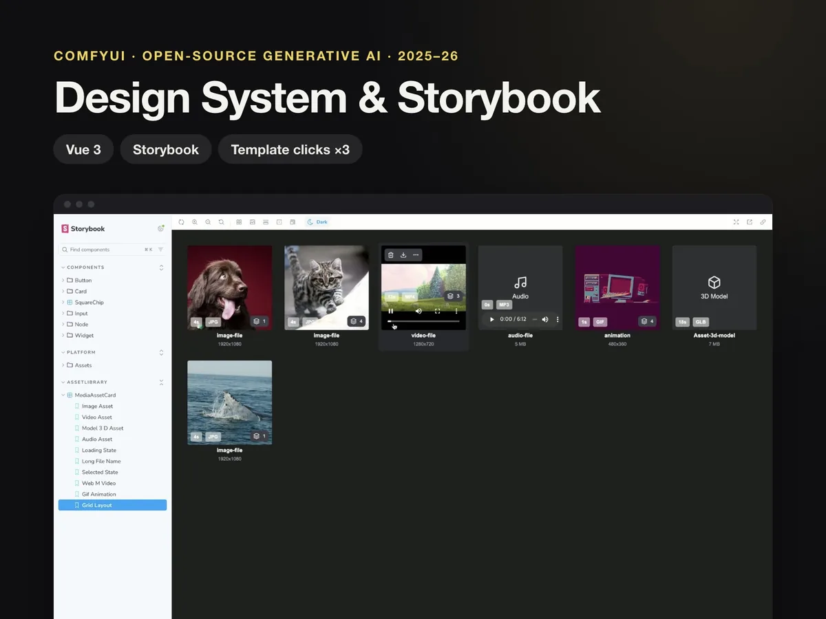
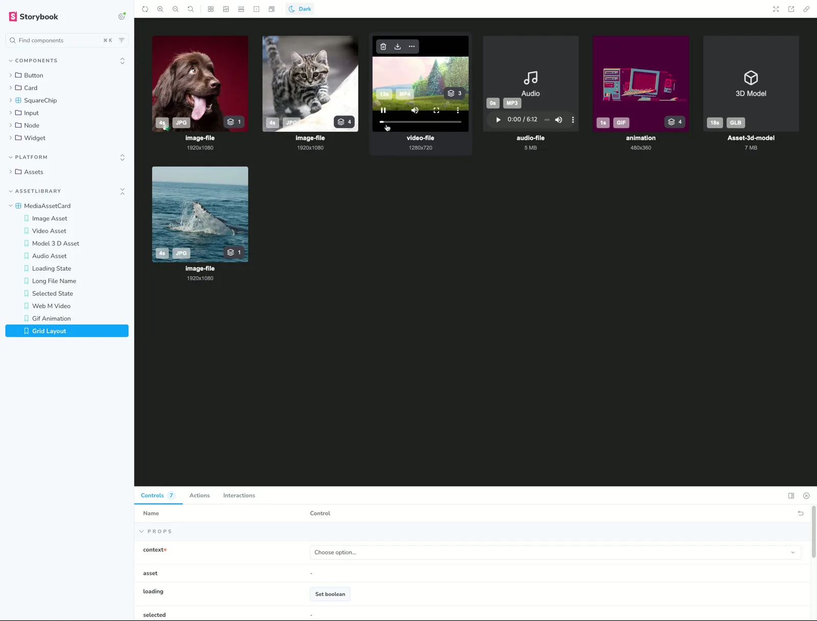
- Opened a Storybook PR first to make component fragmentation visible, which got the team to agree on a design system.
- Designed Modal / BaseModalLayout primitives and migrated every product modal one by one: Node Manager, Model Browser, Workflow Template, Settings and more (up to 54 files in a single PR).
- Merged three separate search components into one SearchInput and moved hard-coded style values to Tailwind design tokens.
- Replaced PrimeVue AutoComplete, ProgressSpinner and Galleria with in-house components and improved keyboard accessibility, including an Escape event propagation bug.
- Proposed turning static loading time into a brand moment, then designed and built a logo-fill loading indicator and splash screen as shared components.
Results
- Template clicks ×3
After the Workflow Template modal moved to the new design system, the number of users who actually clicked a template tripled.
- Instant closes down 50%+
The share of users who closed the modal right after opening it dropped by more than half.
- 60 design system PRs merged
As Code Owner I merged 60 PRs in the design system area (+12,599 / −7,803 lines).
Key features
- 01
Component docs in Storybook
Shared components documented in Storybook, so visual review with the design team and onboarding for community contributors got easier.
- 02
Modal / BaseModalLayout primitives
Shared primitives so every modal in the product uses the same layout, spacing and behavior.
- 03
Logo-fill loading indicator
A loading animation in the design system that turns waiting time into a brand moment.
Screens
Links